Multi-format ad design, Amazon product imagery, and icon system for a solar and power equipment brand
Client
Lion Energy
Year
2024-2025
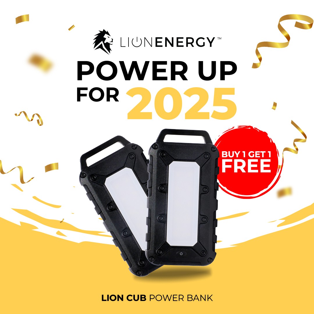
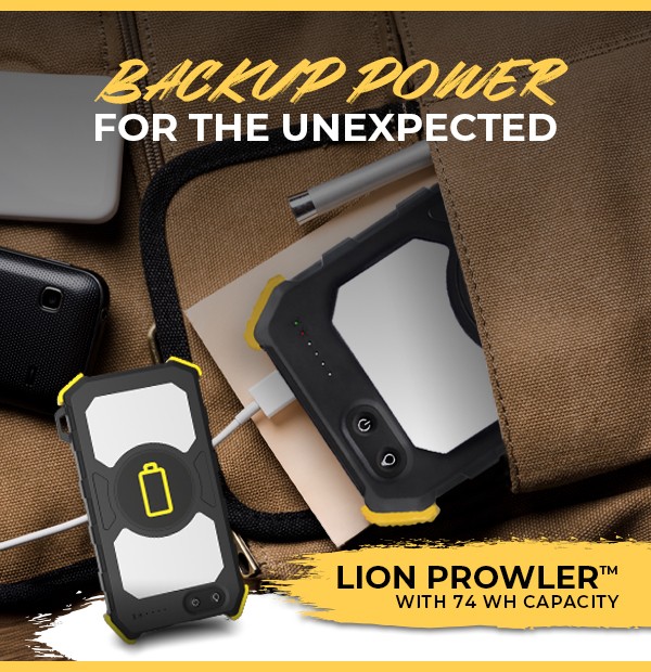
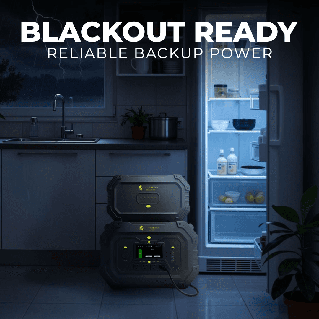
Lion Energy needed a steady stream of ad creative that could keep up with a packed calendar of holidays, sales pushes, and product launches. Rather than a single campaign, this was an ongoing design partnership built around speed, consistency, and adaptability across formats.
Scope of Work
Graphic Design
Ad Creative
AI-assisted compositing
Icon design

The Challenge
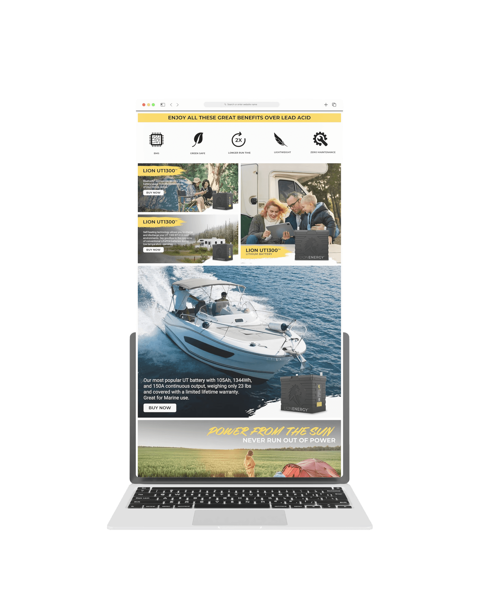
Solar and power equipment is a category that doesn't naturally lend itself to constant visual variety. Lion Energy needed ads for different occasions throughout the year, plus dedicated pushes whenever they wanted to move specific products. Each one had to feel fresh enough to earn attention, while still being unmistakably Lion Energy. On top of that, their Amazon listings needed product imagery built to a completely different standard: clean, conversion-focused, and compliant with marketplace requirements.
The Approach
I treated every ad as its own small design problem inside a consistent brand framework. For seasonal and occasion-based ads, I built creative around the moment (a holiday, a sale event, a new product) while keeping typography, color, and layout language tied back to the brand. For select ads, I used AI-generated backgrounds as a starting point, then refined and composited them in Photoshop to get lighting, texture, and product integration that looked intentional rather than synthetic. This let me produce more variety without sacrificing visual quality.


For Amazon, I designed product page images built specifically for marketplace conventions: clear hero shots, benefit callouts, and lifestyle context, all formatted to perform well in a shopping environment rather than a social feed.


AI-Generated Backgrounds, Refined in Photoshop
For a portion of the ad set, I used AI-generated backgrounds as a starting point rather than a finished asset. Each one went through a Photoshop pass to correct lighting, blend textures, and integrate the product naturally into the scene, so the final result looked intentional and photographic rather than synthetic. This hybrid process let me produce more visual variety across campaigns without slowing down turnaround or compromising quality.


The Icon System
Alongside the ad work, I developed a custom icon set to support Lion Energy across marketing materials. The goal was simplicity and recognizability. Each icon needed to communicate a key idea at a glance, whether that was a product feature, a use case, or a benefit. I designed the set to be flexible and scalable, so the same icons could show up on an ad, a product page, or a one-pager and still feel like part of one cohesive system.


The Result
The combined system gave Lion Energy a flexible creative toolkit: ad templates that could adapt quickly to new occasions and sales pushes, Amazon imagery built to convert in a marketplace context, and an icon language that reinforced brand recognition across every touchpoint.
